

Aperture
Industrial AI that closes.
A two-person AI startup came in with a working agent and 90 days of runway. Their tool reads industrial parts catalogues — PDFs, supplier emails, jargon-dense spec sheets — and hands a sales rep a quote-ready bundle in seconds. They needed a marketing site that converted demos from procurement managers aged 50+. People who don't trust polish.
Stop selling "AI." Sell silence — the silence of not reformatting a PDF on a Friday afternoon. The hero is a Three.js animation of a parts diagram dissolving into a finished quote. No tagline on the first screen, no marketing copy. The product is the demo.
Will it read my supplier's worst PDF?
Yes. The ugly ones are the point.
How long to a quote?
Seconds. The hero shows it happening.
Do I have to change how we work?
No. It reads what you already get.
What if it's wrong?
You see the source line. You decide.
Who's behind it?
Two people. You'll email them, not a bot.
First direction was a conventional B2B SaaS layout — feature grid, three-up testimonials, footer CTA. We killed it. The buyer doesn't trust polish; polish reads as "another vendor lying to me." We rebuilt as a single long-scroll with five "question / answer" sections, each anchored on a real industrial part. Demo request inline. No modal.
Ten directions. One shipped.
Every project starts as ten homepages, fully built. The client picks the one that ships. The other nine aren’t waste — they’re the proof we looked before we leapt.
 picked
Split-screen: left panel shows the chaotic inbox (crossed-out items, warnings), right panel shows Aperture's resolved quote card in seconds. The gap between the panels is the product.
 rejected
Intelligence-file aesthetic: classified header bar, ruled data table with live metrics, capability summary list. Mono labels, amber CTA. Sells trust through structured precision.
 rejected
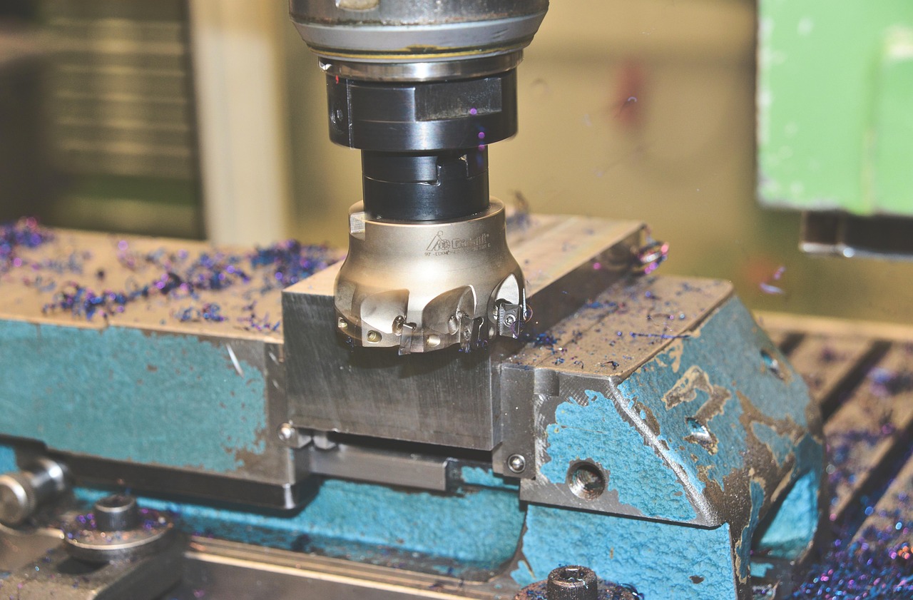
Full-bleed industrial machinery photo dominates the viewport with a strong gradient overlay. Hollow-stroke headline, amber CTA. The image IS the argument — this is where the product lives.
 rejected
CLI / terminal aesthetic with an interactive demo: user clicks 'Run demo' to watch Aperture process a spec sheet line-by-line in real time. Green-on-black, monospace throughout.
 rejected
Brutalist layout: light off-white background, hard 2px borders, no border-radius. Giant outline headline. Dark spec table with part-IDs. Four-column pillar grid. Factory-print aesthetic.
 rejected
Minimal centered statement on charcoal. One enormous headline. Maximum whitespace. Vertical rule. Three small stats below. Portrait testimonial. The restraint is the message.
 rejected
Asymmetric bento card grid: stat cards (conversion, session, close rate), input/output tag clouds, a machine photo card, testimonial card, and an amber CTA card. Dense value, zero hype.
 rejected
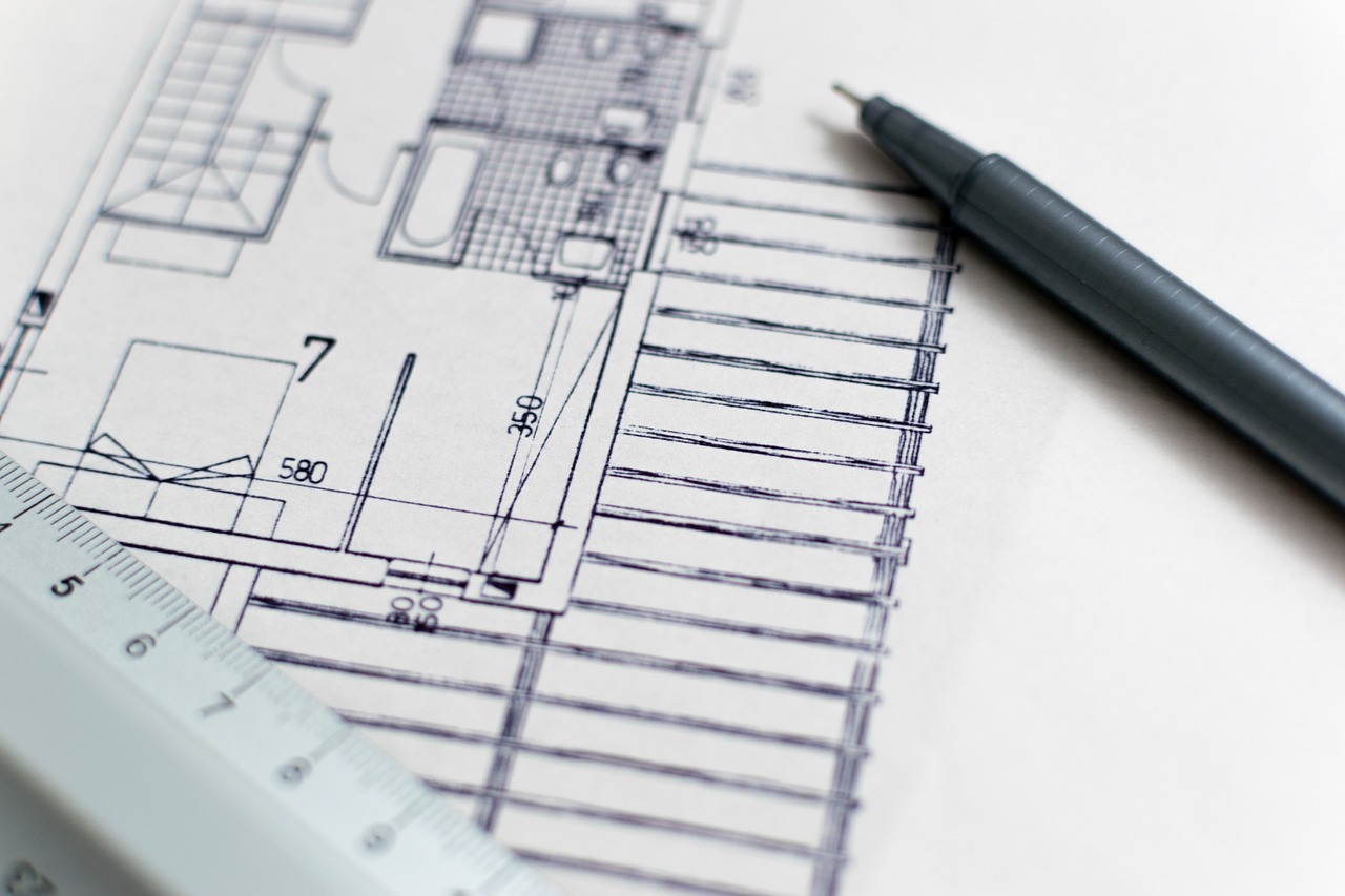
Blueprint schematic overlay: fine graph-paper grid, engineering drawing annotation markers, dimension callout lines, DWG reference label. Deep navy. Blue accent. Product as a technical drawing.
 rejected
Stats ARE the headline. Four giant metrics stack vertically with full context lines. Sticky right column holds the testimonial card and a '18 days to ship' proof card. All receipts on the table.
 rejected
A supplier email rendered with redaction bars over key data fields. Aperture's resolved output shown in the right column. Interactive 'reveal' button lifts the bars to show resolution. The chaos is the hook.
Single-page Next.js site. Three.js hero. Five anchored sections. Payload CMS for the part-spec library. Resend for the demo request handler. Built in 18 days by two people.

demo conversion vs. previous Webflow site, first 30 days
avg. session — industry baseline: 47 seconds
demos requested / closed in week one. their best month on record
monday, 11pm. brief over slack. signed before midnight.
first direction: feature grid, three-up testimonials, footer CTA.
killed it. the buyer is procurement, 50+. hates polish.
new direction: long-scroll, five questions, real industrial parts.
three.js hero locked. parts diagram dissolving into a quote.
founder said "what if we removed the testimonials entirely?" we did.
payload wired. founder added four parts that night.
resend webhook. demo form looks like a human wrote it.
usability test. procurement manager asked who built it.
shipped. two of us, awake at 3am, watching the first demo come in.
We'd ship the first Three.js direction even though we hated it. The founder would've told us it was wrong in five minutes, not six days.
We'd wire Payload on day one. The founder kept asking to add parts on day six.
We'd write the case-study copy during the build, not after. The launch tweet landed before we had words ready.
“They shipped the site faster than our last agency briefed it. And it converts.”
Every build leaves a mind.
We keep the whole thinking behind a build — specs, decisions, the directions we killed — as one linked graph. This is Aperture’s mind. Soon every project ships with its own, and you keep it.